Bench Accounting
Design System and Brand Refresh
The challenge: How do we leverage Figma’s features aimed for product teams to use as a brand team?
To further support the visual refresh, there was a revamp of the design process internally to establish a consistent standard across all department assets. This was achieved by implementing a brand design system with unified Figma libraries and templates.
Deliverables:
~16 week timeline
New Brand guidelines
New Illustration library with AA tested color palettes
New AA Color Palettes library
Imagery library
New logos
Update all landing pages with new illustrations
Refreshed web components
Voice and tone guidelines
Defining core values established the process of the brand refresh via guidelines:
Clear
Running a business can be complicated. Our visual identity is not. We strive to build an experience that values clarity above all else.
Consistent
Consistency is our biggest asset in developing trust. Every touchpoint carries the same visual DNA, from the top of the funnel to the Bench app.
Inclusive
Bench is actively engaged in inclusivity throughout our workplace, and visual identity is no exception. Accessibility is a priority in all designs.
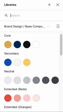
Color refresh
This was the largest change brought to brand refresh. The past colors were not accessible, especially in certain color pairings. The color palettes lacked scalability to adapt to other assets such as illustrations.
Corporate color combo: The main color combination used for illustrations on the website, corporate communications.
Extended color combo: Additional color combinations for a more expressive environment such as blog, paid ads, and campaigns .


Skin tones: To extend inclusivity we implemented a skin palette that included a spectrum of colors to use for illustrations.
Color proportions: These high level ratios represented the color pairings that could be used in a functional vs expressive way.
Sunray Gold, Electric Blue, White and Eerie Black were used for text, imagery, hyperlinks, call to actions and base illustration colors.
The extended color palette was only used for more expressive channels and for assets such as illustrations.

Color combinations: As inclusivity is a creative standards, it was vital that all text color combinations needed to meet AA accessibility standards. The color palettes and pairings were created with accessibility first.
Tools I recommended that were added into our design process.
WebAim
Figma plugin—Contrast

Background colors: Deep Sapphire or Ghost White as the primary choice for the background colors. It was tested that Sunray Gold was not accessible as a background color with white text.

Buttons: the old primary button was in teal, and during the AA audit it was found to not be accessible especially paired with white text. Primary button was changed to electric blue.

Before 👀
After ✨
After✨
My favorite part of this refresh was defining color palettes for our Figma design system. Enabling global theme changes in every file. Here’s what it looks like. Nothing more satisfying :’)

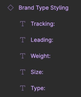
Type styling base
Creating a consistent design system was one of the main goals of this brand refresh. While we retained Bench’s typography. The focus was on refining guidelines, pairings and creating components from the type stack.


Logos
With the new color palettes, logos were updated and clearer guidance on usage was outlined in documentation.

Black + Gold
Use case:
· The primary logo, which should be used in the majority of assets.
· This logo should be used when it is placed on a White or Ghost White background.

White + Gold
Use case:
· This logo should be used when the logo is placed on a Dark Sapphire or Eerie Black background.

Full Black
Use case:
· For instances in which only a one-color logo is required (e.g. printing specifications).

Full White
Use case:
· This logo should be used on backgrounds, where the gold glyph is not accessible (e.g. placing the logo on an image).
· Used when the logo is placed on an Electric Blue or Sunray Gold background.
Imagery
Bench’s imagery now reflects three main aspects close to our heart: our people, our clients and our product. The past imagery library consisted only of people photography. Lifestyle and product images were added to the library for this refresh.

People: Photography that reflects the Bench brand.

Lifestyle: Various in-situ imagery reflecting common themes around small businesses.

Product: Shown as either in its fully functional form or in an abstract form for simplicity for certain assets.
Illustration
The illustrations style was refreshed —featuring clean lines that pair well with our brand iconography style. Due to the wide range of categories they are easily adaptable for various assets such as blog headers or social posts.
Before 👀


After ✨


Some core examples of the illustrations in Bench’s primary colour palette.
Once defined, all existing and future channels with illustrations were updated.


Another addition to the design system. Color variants with the ability to change the color or add without a background. This made design even faster and more efficient.


Iconography

Bench’s brand iconography has a distinct line art style and is used primarily in our emails, landing pages and corporate collateral. Color refresh for icons and usage provided both a primary and secondary palette with guidance documented.

Bench’s product iconography is minimal and clear—these icons are primarily used on the app and focus on usability.
Base components
Clarifying base component UX enabled designers to combine & iterate on more complex components without breaking from the design system.

Reflection 💭
This brand refresh was more than just clearing the design debt, this was an opportunity for our team to start with a fresh slate and envision what the future of the Bench brand could be.
Keeping the design system simple with mostly colours, type, illustrations and some basic components allowed for the most creative freedom. This removed the most tedious part of setting up a new file and allowed us to go straight into designing.
The next phase I was exploring for Bench's design system, was to implement design token standards. This is particularly important with the release of the new Figma to Webflow plugin, as it would provide a centralized source of truth for both designers and developers.
The Impact 📈
Our output doubled YoY with these new libraries. All our deliverables across channels were more cohesive and overall, our team was able to collaborate more easily.
3x increase in page creation
30% improvement in lighthouse performance
Credits:
Designers: Arshi Chandranath, Noemi Cisneros