SiteSoft
CHANGING THE WAY FOR HEALTH AND SAFETY IN AUCKLAND
INTRODUCTION
SiteSoft helps businesses create a safe environment for everyone in their workplace. It has over 500,000 users and is one of the few health and safety software providers that has ISO 27001 accreditation – vital for government departments and large listed companies. The platform is available via web portal and app. This platform allows for easy reporting of incidents, hazards, compliance standards, training, pre-starts and inspections without the need for paper forms, streamlining workdays.
2019
YEAR
Sketch, Zeplin
TOOLS
iOS & Android, 4 weeks
SCOPE
UX/UI Designer, Research, Journey Mapping, Prototyping
MY ROLE
Problem
Existing app is extremely confusing to use and fails to offer any benefits.
The current mobile app existed as a proof of concept only, with no design direction or overarching UX. It became very clear that while functionality was working, the grouping of items and navigation was not in a useable form. I sought to rectify these issues with a complete re-design from scratch, taking the core components and fleshing them out and giving more direction and purpose to each flow.
How might we help workers stay focused on their tasks and complete them efficiently and effectively?
The process
Working with the CTO defined the project goal of SiteSoft for better customer alignment.
Step 1: Outlining project scope
Business Objectives
Better align product offerings with demand
Increase service conversion rate
App must complement existing web app
Constraints
Restrictive deadlines and timeline
Single cross-platform design
Junior-level developers
Customer Goals
Achieve health and safety compliance
Increase efficiency in completing tasks
Check for the latest updates
My Responsibilities
Leading design efforts (wireframing, visual, prototyping, layouts, etc.)
Faciliting user testing
Step 2: Defining the users and goals
The typical user of the app is someone who belongs to the working class and is aged between 25 to 50 years old. They may have varying levels of technical knowledge and experience, and also come from diverse language backgrounds due to the multicultural nature of New Zealand. Therefore, the app needs to be user-friendly and have intuitive icons that can be easily understood by all users.
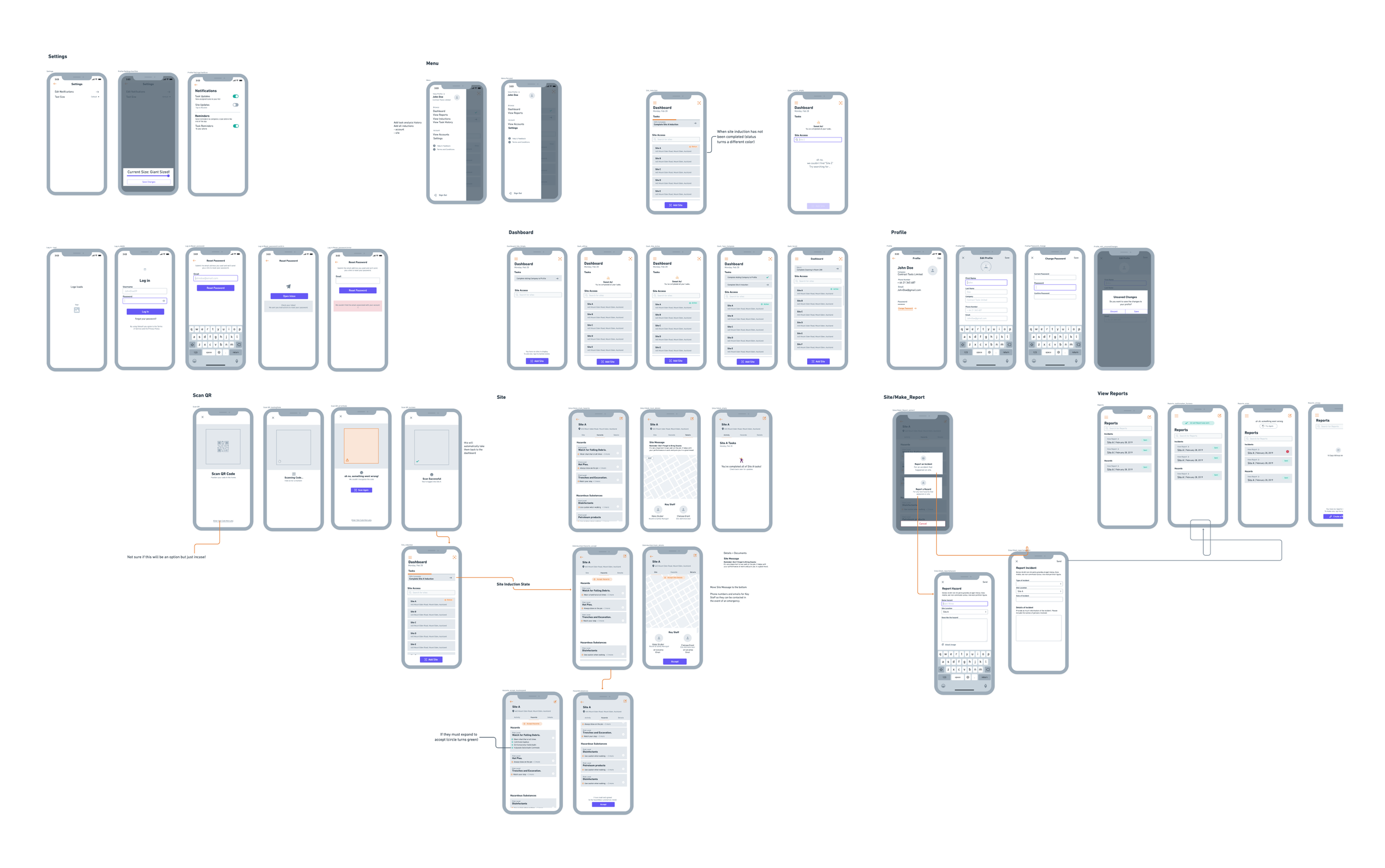
Step 3: Map it out
Once I had completed the underlying UX map, I created wireframes and presented them to the company's stakeholders. The UX map provided a big-picture view of the project, which helped the stakeholders understand the overall plan. By showing the large-scale plan early on, I was able to receive positive feedback and constructive criticism. The stakeholders were able to provide valuable insights based on their experience, which helped us refine our approach and ensure that we were on the right track. This feedback allowed us to solidify the foundation of what we hoped to achieve and make any necessary adjustments before moving forward with the project.
The designs
Once all the concerns were addressed, the wireframes were implemented as high-fidelity designs
↓
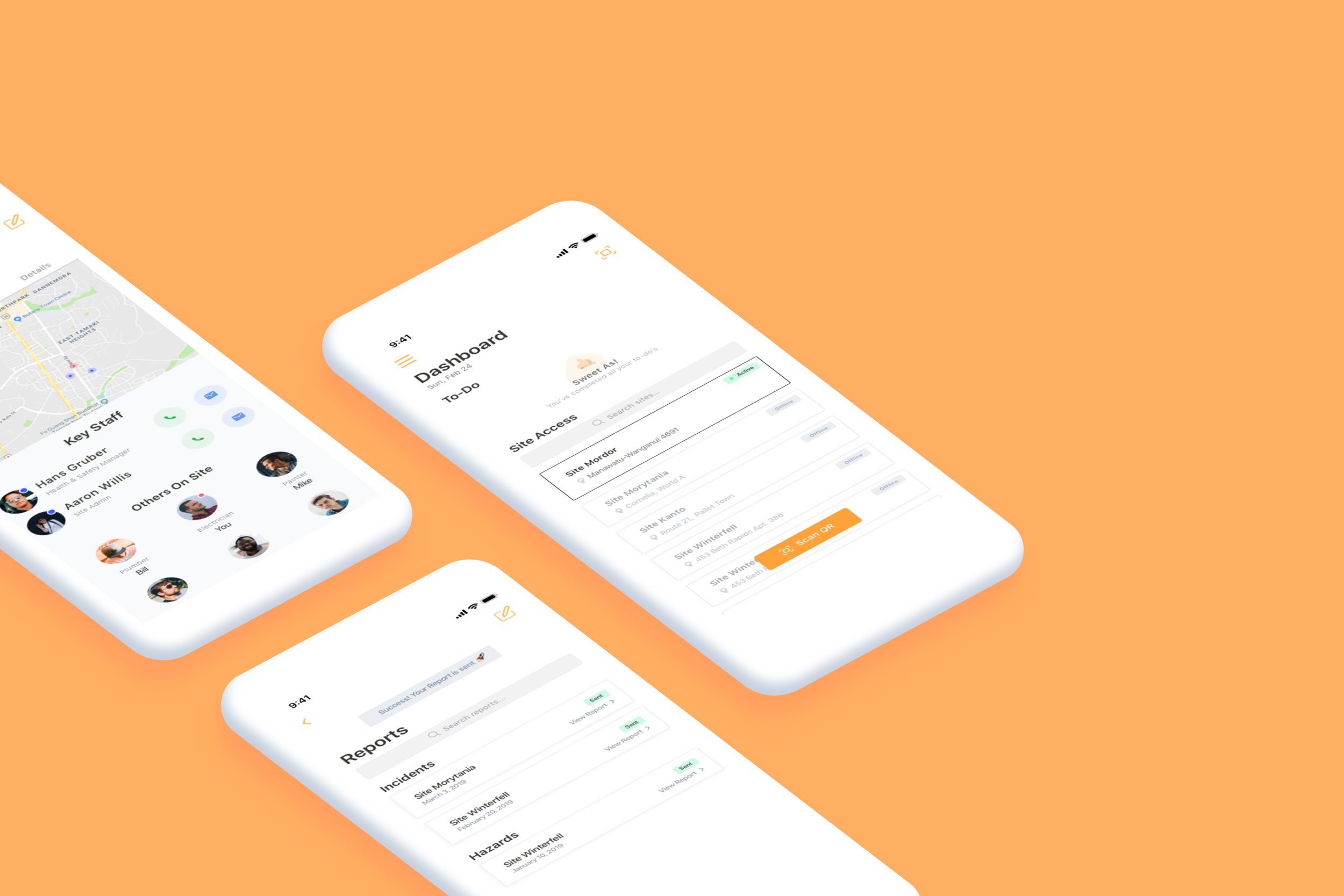
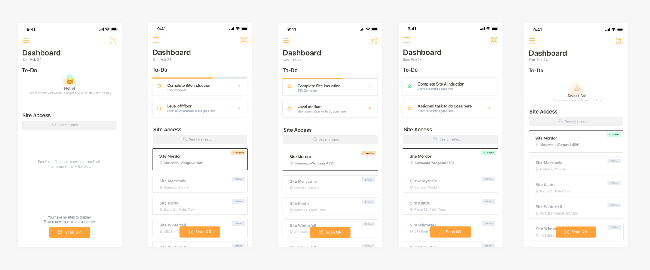
Dashboard
Gotta Go Fast
Workers can easily scan in, track tasks, and perform various actions on-site.
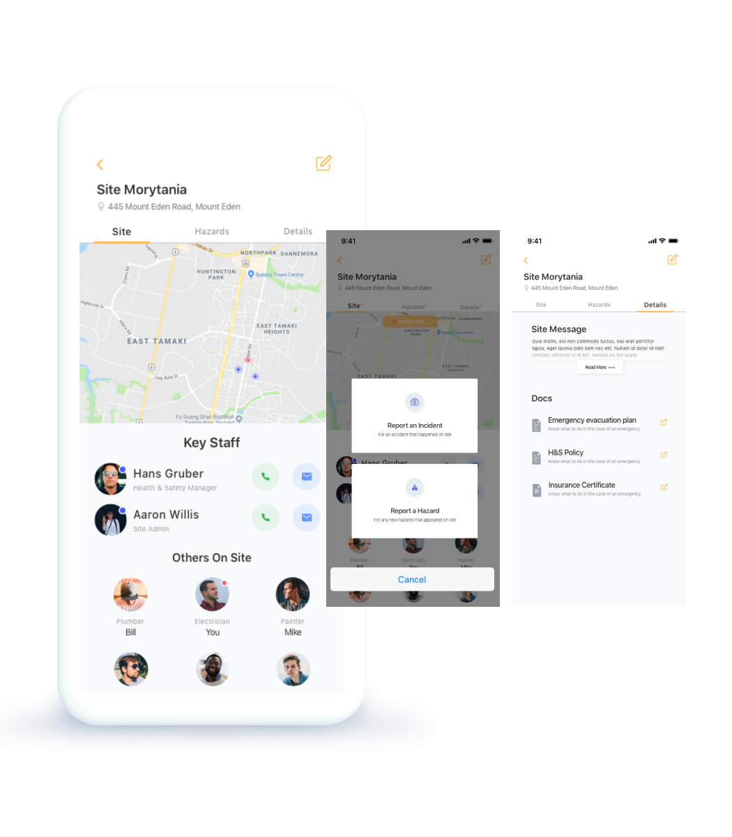
Site
This is where workers can access site-specific information, including contact information for key staff, hazard identification, and important documents.
All In One
Workers can access site details, report incidents or hazards, and find important documentation or updates.
Reports
Workers can easily review and search through reports made
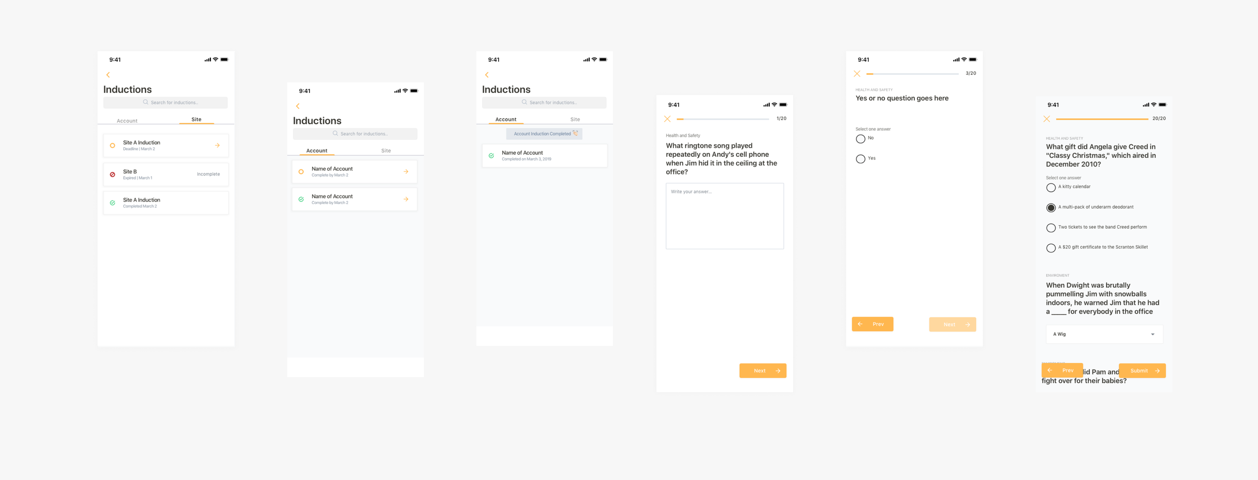
Inductions
Workers need to complete site and account inductions. With clear deadlines and completion dates, this ensures they will.
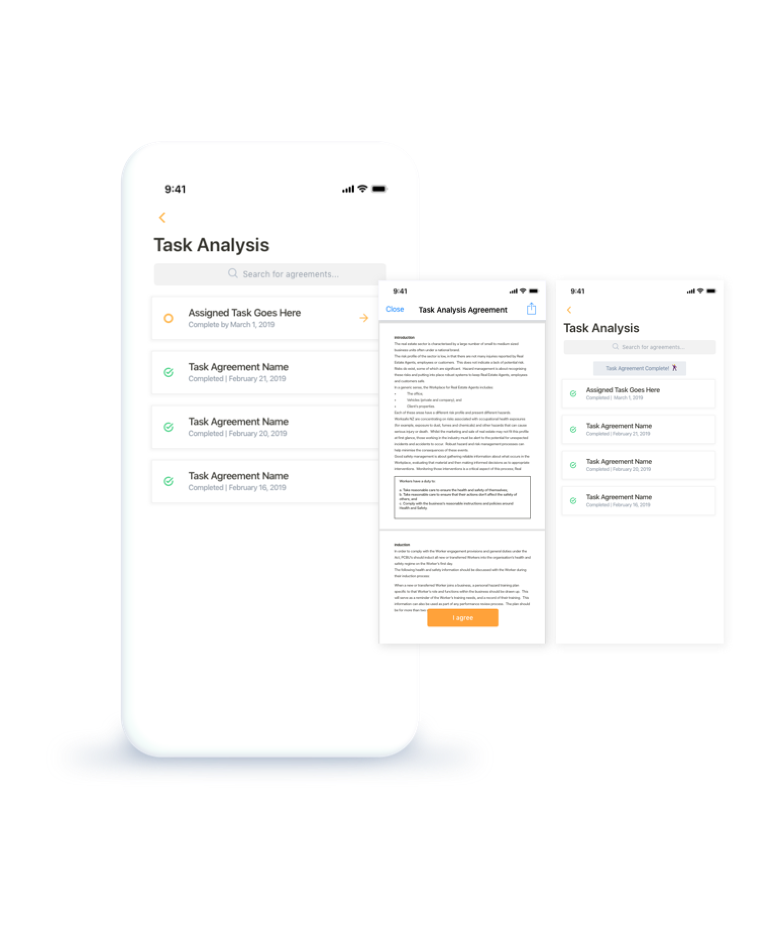
Task Analysis
Workers can review and search for completed tasks.
Reflection 💭
At the onset of this project, I encountered a significant challenge with regards to its scope. Consequently, I had to exercise utmost resourcefulness and judiciously allocate my time and effort towards the areas where they would yield the most desirable outcomes. Subsequent to receiving feedback, I was tasked with refining my designs to produce a high-fidelity version within a week. In order to accomplish this, I resorted to implementing the double diamond framework, which facilitated a comprehensive exploration of diverse design solutions in a swift and efficient manner. During this period, my time management skills were put to the test as I was not only undertaking a complete redesign but was also required to balance it with a full-time school schedule amid midterm season.
I made it my priority to identify and prioritize the essential features that would address the needs of our users.
To ensure that users can quickly perform actions and navigate to the appropriate section of the app at the right time, I segmented the app into an overview and site mode. This enabled users to easily find and access the features they needed based on the task at hand.
Update: Looking back on these designs from 2024. I've come to realize that it's really important to prioritize accessibility in designs and take the time to understand the routines of workers so we can establish better patterns. It's all about creating a more user-friendly experience!
The impact 📈
Some reviews from users ✨
“Great safety tool for contractors and staff”
1.5x more tasks completed
“Comprehensive information gathering and sharing. Keeps track of those on site and ensures that protocols are understood and followed.”
