Akshon Esports
CONNECTING PEOPLE, TEAMS AND PLAYERS TO THEIR COMMUNITY
INTRODUCTION
Akshon Esports is a media company that specializes in covering competitive Esports news across various games, including Overwatch and League. They are known for their popular Overwatch content on YouTube.
Sketch, Zeplin
YEAR
2018
TOOLS
UX/UI Designer, Research, Journey Mapping, Prototyping
PLATFORM
Web, 4 weeks
MY ROLE
Problem
Akshon Esports shifted their attention from written to video content, prompting a need for a visual update and more adaptable framework for content.
How can we deliver the latest gaming and esports updates in an easy-to-digest format?
The process
Step 1: Outlining project scope
Having worked at Akshon for about a year now, I learned a ton about what they did best and what fans really enjoyed from their content. In order to build a more cohesive and recognizable brand, I started with the branding and built a style guide that could be scaled in the future.
Next, I focused on creating a smooth responsive design. In order to achieve this I started designing the overall layout on mobile first.
With this base started, I can easily add more to the designs and features as the browser size increases. This sets up for a smoother handoff for developers.
Constraints
Junior-level developers
The team consisted of inexperienced junior-level developers. There was a close collaboration with development from the start of the project. I looked for APIs and resources that were already built where the developers could take notes from.
My Responsibilities
Leading design efforts (wireframing, visual, prototyping, layouts, etc.)
Faciliting user testing
Step 2: Defining the users and goals
Based on the current user base, it is found that users between the ages of 16 to 25 are interested in getting the latest updates in the gaming domain. From the user research conducted, it has been observed that several users tend to read the articles while on the move or during their commute. Thus, it is crucial to prioritize having articles with large and legible titles to ensure easy readability.
Step 3: Map it out
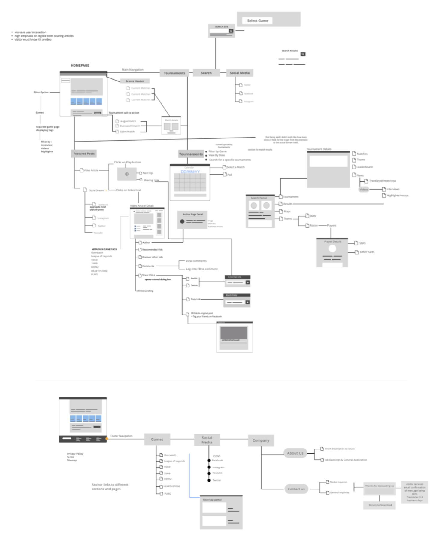
Once I had completed the underlying UX map, I created wireframes and presented them to the company's stakeholders. The UX map provided a big-picture view of the project, which helped the stakeholders understand the overall plan. By showing the large-scale plan early on, I was able to receive positive feedback and constructive criticism. The stakeholders were able to provide valuable insights based on their experience, which helped us refine our approach and ensure that we were on the right track. This feedback allowed us to solidify the foundation of what we hoped to achieve and make any necessary adjustments before moving forward with the project.
The designs
With the information architecture now in place, we have a clear and organized framework to build upon.
↓
Home sweet home
Mobile
When finalizing the layout, the challenge was to account for the varying length of titles. To tackle this challenge, I conducted extensive research and experimented with different font styles and sizes. I paid close attention to the placement of the titles, as well as the spacing between them and the other elements on the page. I wanted to make sure that every user could easily read and navigate through the content without any difficulty.

Home sweet home
Desktop
After finalizing the designs for the mobile version and running thorough tests to ensure its functionality, the next step was to create a desktop version.
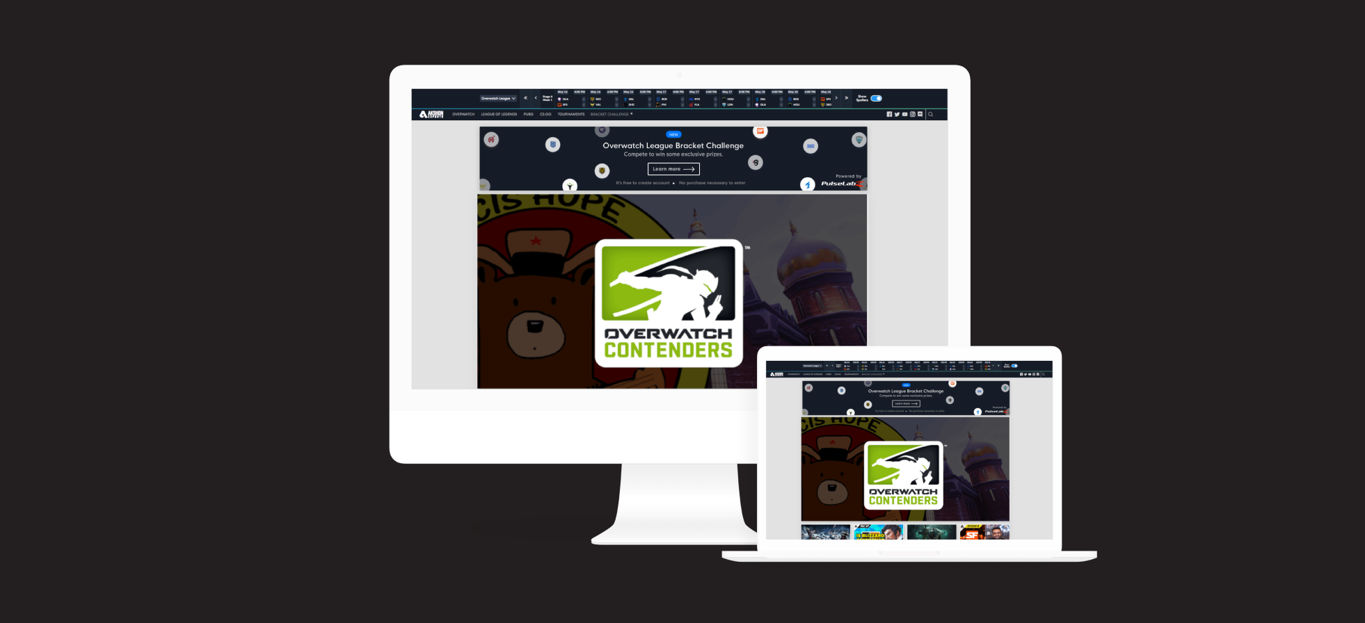
To make the platform even more engaging and informative, a Social Buzz feature was included to allow users to stay up-to-date with the latest posts from Instagram.

NEW
Tournaments feature
We implemented a scoreboard and bracket feature to enhance user engagement and retention. This new feature was aimed to offer users a more interactive and competitive experience, which would encourage them to visit again.
Mapping it out
Having an information architecture in place was helpful for dividing up the work and prioritizing tasks.

Tournaments
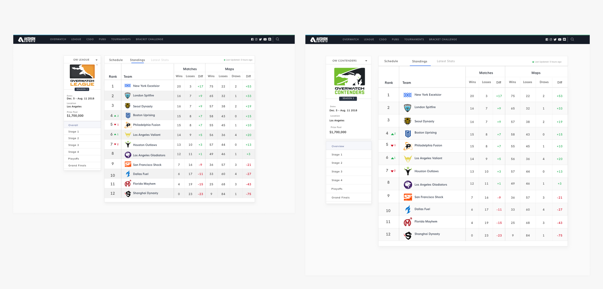
I developed reusable components to ensure consistent experiences across the tournament feature.
With this feature users can:
View Team Placing & Scores
Browse Tournament Schedule
View Team Roster & Mains

No spoilers 🙈
Many users watch game replays before learning the scores.
With this toggle for spoilers it lets them browse tournaments without spoilers.

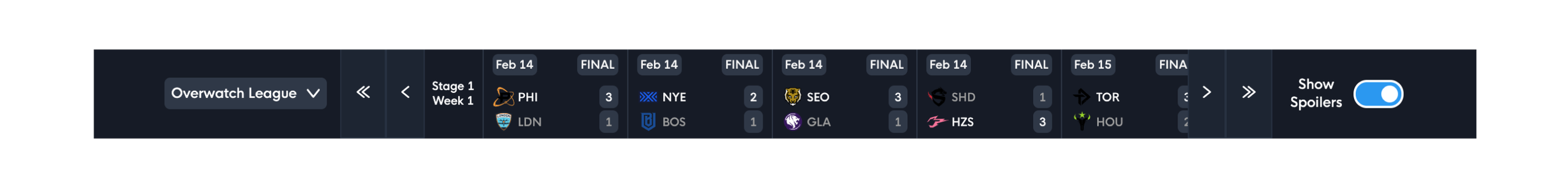
Users can now easily view scores from recent games on any page. Without intruding a user’s view, the scoreboard would collapse upon scroll.
Bracket challenge
This idea was inspired by the bets we had in the office during the preseason of Overwatch League. We wanted to create something for users to participate in while watching the games.

The Impact 📈
After adding the tournament bracket, Akshon attracted more than 1,000 daily users who participated with their friends. The main objective of implementing these new features was to increase the number of subscribers to Akshon's YouTube channel. This was the strategy that led to Akshon's first 100k subscribers.